Pet Adoption Website
Client: Certification project
Problem: Users felt overwhelmed by all the information on a local animal shelter’s website.
Goal: Design a responsive website with a more digestible layout
Solution: Create a way for users to search available pets with the option to filter results
Responsibilities:
User research, paper and digital wireframing, low and high-fidelity prototyping, accounting for accessibility, conducting usability studies, and iterating on designs
My Role:
UX designer from conception to delivery
March 2023 - May 2023
Made using Adobe XD
User Research
Persona and User Journey Map
I conducted user interviews and secondary research which lead me to create personas, user journey maps, and an effective problem statement.
Problem Statement:
Ava is a professional working from home who needs to adopt a dog because she wants to feel less alone and improve her mental health.

Mapping Ava’s user journey reinforces the need for better organization of all the information shelters provide about each pet. It also highlighted a desire for online forms.

Ideate
Paper Wireframes
I created wireframes for the main pages of my user flow with a desktop layout in mind. In order to ensure the website is responsive, I also sketched the homepage layout for a desktop, tablet and phone.


Design
Digital Wireframes
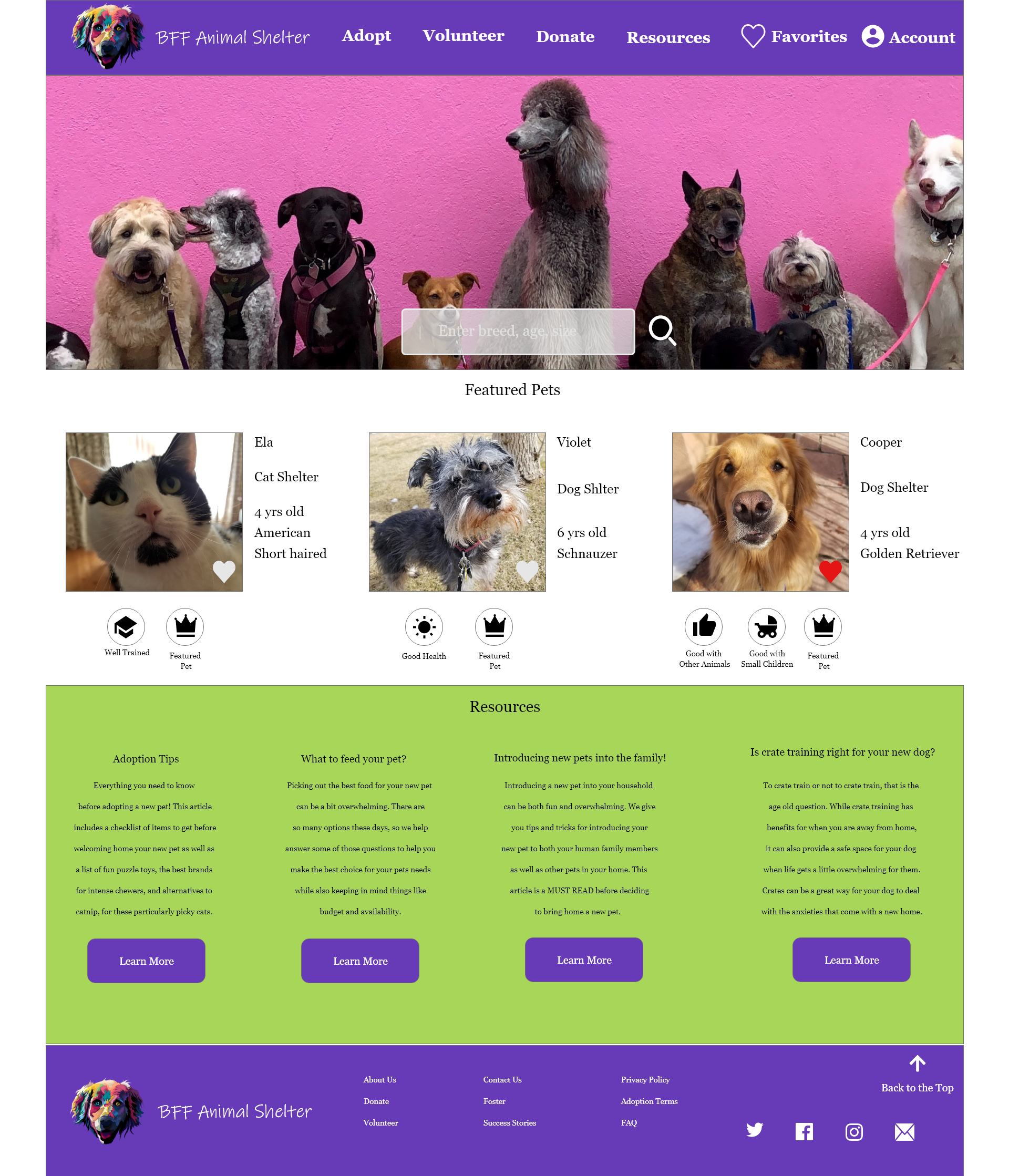
During my user research, I learned that many users found the shelter websites to be overwhelming, hard to navigate, and have no options to filter animals based on characteristics.

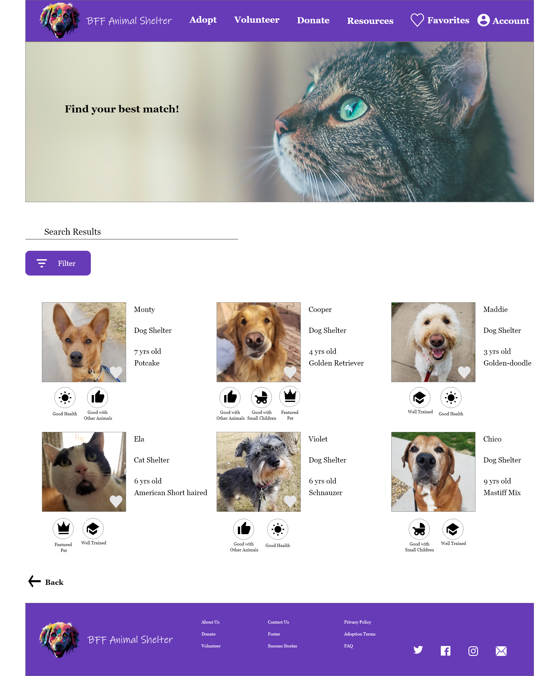
There is a search bar at the top of the homepage allowing users to narrow down their options as soon as their search begins.

Under the pet photo, I included icons that will feature key characteristics that might be of interest to potential adopters.

Having the ability to filter search results allows the user to really curb the number of pet profiles they see even further.
Prototype
Low-Fidelity
Using Adobe XD, I created a low -fidelity prototype to refine the main user flow and to use for my usability study. In keeping with creating a responsive website, I designed the prototype for both desktop and mobile. I did create wireframes for a tablet version as well, however the mobile version required more redesign so I chose to showcase that instead.
Here are links to the desktop prototype and the mobile prototype.
Desktop Version
Mobile Version
Test
Usability Study
My usability study was unmoderated and consisted of 5 participants from an online group for people looking to adopt a pet in my area.
Findings
Users wanted to pick from a list of available times

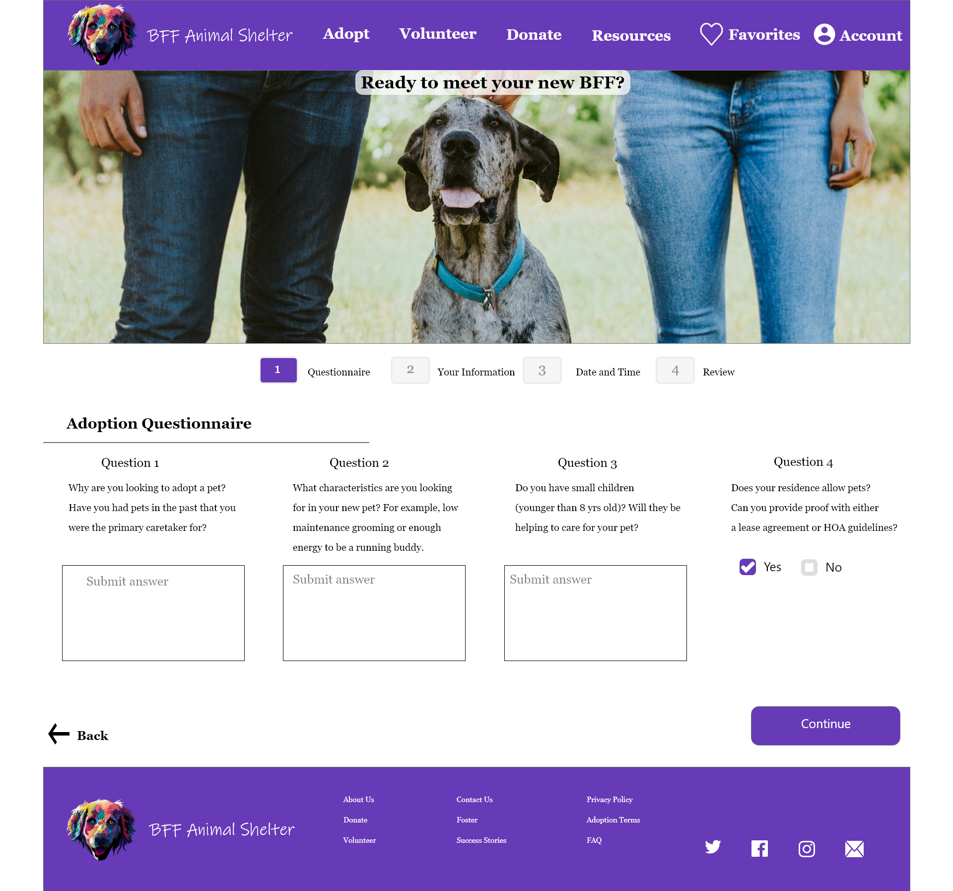
Users expressed feeling unsure about continuing the process to schedule an appointment without knowing how many steps there would be.

Having two search bars on the main page was confusing to users

Iterate
Usability Study Results
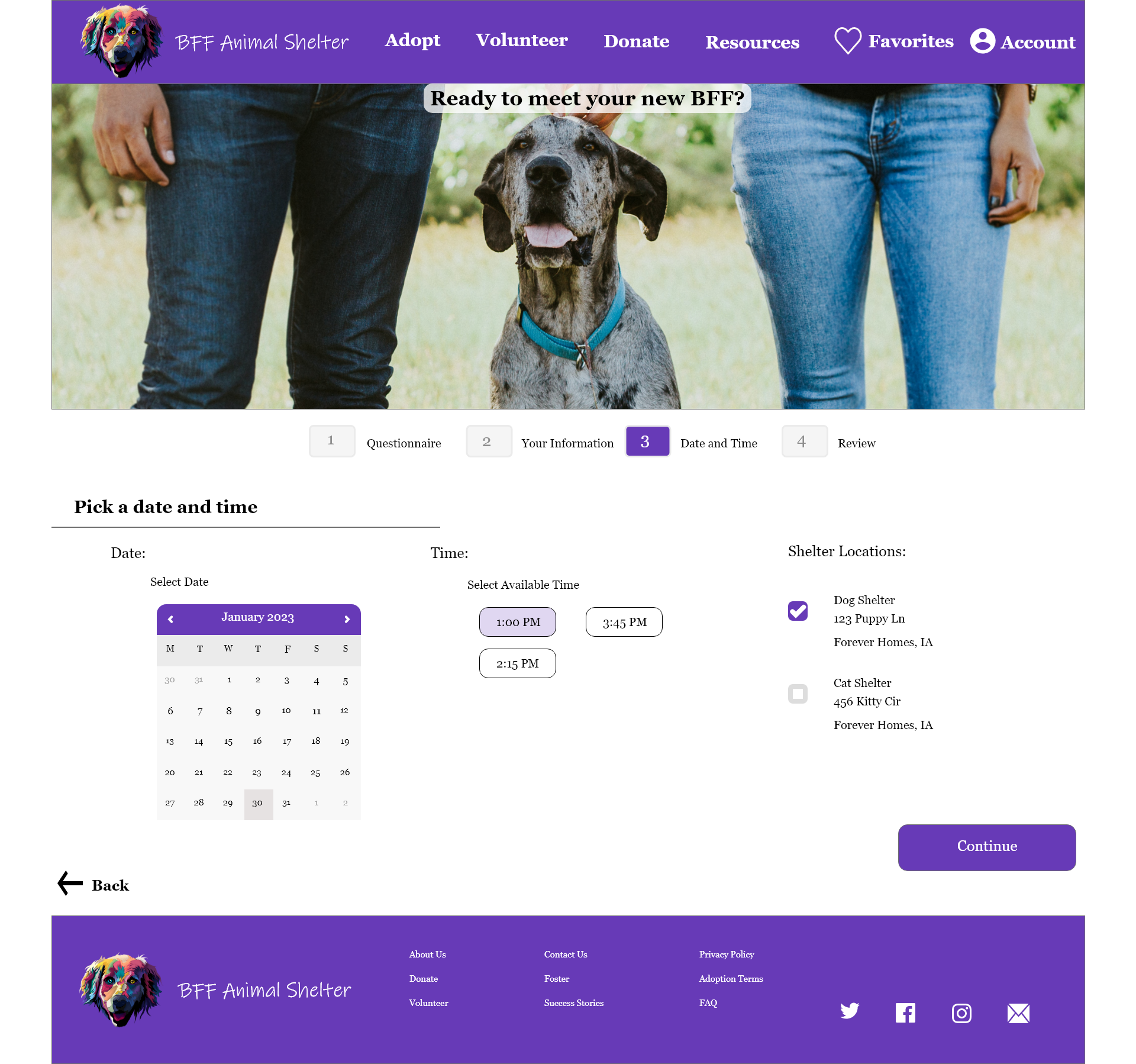
I removed the clock features and created buttons for the available times. I also updated the calendar with one from the design kit Material.io and the brands colors.
Before

After

I added a progress bar to the first page after selecting to schedule an appointment. This will give users a clear indication of how many steps are left in the scheduling process.
The progress bar I used for the desktop version was too bulky for the mobile version. The final iteration for the mobile version includes a sleek yet comprehensive progress bar.
Before

1st Iteration

After

I reduced the search bars down to one. The second search bar was redundant because the user will have the ability to filter their results further on the next page.
Before
After

Design
Final Iteration


Prototype
High-Fidelity
For the high-fidelity prototype I wanted to focus more on presentation, with smooth and interesting transitions. Using elements from existing design kits allowed for clickable hearts and check boxes, a beautiful drop down menu and calendar, as well as a perfect progress bar for both desktop and mobile.
If you would like a more hands-on look at the prototypes, here are links to the desktop version and the mobile version.
Desktop Version
Mobile Version
Takeaways
What I learned from this project:
The design challenges that were presented when trying to create a responsive website were fun and interesting to solve. Having to redesign elements, such as the progress bar and filter page, was a fun way to stretch my creativity and design muscles. I learned that even a small design change can have a huge impact on the user experience. I also really learned the value of design kits, especially in a time crunch. Being able to redesign components to match the brand I was designing for saved a lot of time and energy.
What I learned about myself as a designer:
At first I was not excited to be switching design tools to Adobe XD after growing very comfortable with Figma. After only a few hours of playing around in XD, I was really excited to have this new tool in my design toolbox. Having basic knowledge of one design tool made transitioning to another much smoother than I expected. I know that design tools are constantly changing and evolving, and now I feel confident that I will be able to grow and adapt right along with them.